Friday, August 10, 2012

Finished Menu

My Menu 


Original Menu


The menu that I created was much bigger than the original. I thought it was very important to keep all the information that the original had, but I wanted mine to be in a more visually appealing and readable format. I thought the font size on the original menu was too small, and also didn't like that the menu was in alphabetical order. As I said before, one of the first things that I did was group the beers in different styles. I then wanted the styles to go in an order which made sense, so I started off by going from lightest to darkest. Some of the beers were in unique categories, so I placed those after the darkest beer grouping. I then placed all the Belgian style beers together, and finally added in the Lambics and Ciders at the very end. I chose to group them this way because it seemed like the best way for customers to be able to easily choose the type of beer they want. Under some of the styles I added in which mainstream beer the style was similar to. 

I wanted my cover page and back page to look slightly different then all the inside pages, so I decided to use one of World of Beer's other logos on the first page. I created this in Photoshop, similarly to how I did with the inside pages. I just used the layer masking tool to blend in the WOB logo. 


Every month World of Beer has a beer of the month, which is only $3. This is always a very popular beer that people ask about, so I though it was important to have on the front page. 

For the last page changed the formatting form one column to two and features what drafts were coming next, and the discounted last call bottles. People are normally the least concerned about these things, so that's why I put them on the last page. I also used photoshop to add in a picture of a Belgian beer that I had taken at World of Beer 


Although my menu has a lot more pages than the original, I think it is much more visually appealing, fits the feel of World of Beer better, and would be much more convent for the customer. I used various told in Photoshop to help create the background pages of my menu, then used InDesign for the text and formatting. This class has been extremely difficult at times, but I have honestly learned more in this class than any other class I think I've ever taken. 


Menu Progress


I wasn't exactly sure how I wanted the cover of my menu to look so I decided to start by creating the inside of it first. I wanted my menu to have a pub-like feel to it, so I decided to take a picture of a wooden door at my house and use it as part of the background for the menu. I then took one of the World of Beer logos and placed it in Photoshop with the picture of the wood. I created a layer mask on the picture of the wood and blended the logo in. 


I then worked on dividing up the menu in the order I wanted it in. The original menu was in alphabetical order, which I did not like. I decided to rearrange the menu by beer style because normally customers search for beer by style, not name. For a few of the styles I also decided to add in a mainstream beer that the beers on the World of Beer menu were similar to. This would help the customer decide what they want if they were not very family with beer.


Here are what a couple of the inside pages of the menu look like. 


Tuesday, August 7, 2012

Finished Newsletter


I am so glad to say that I'm finally done with my newsletter project. I first started off by finding out as much information I could on the Lowry Park Zoo and then deciding what would be the most important to put in my newsletter. Then went through all my pictures and chose the ones that I thought would correspond the best. I decided to have all the main animal attractions be featured on the front page of the newsletter. For the second and third page I showed information about the tickets, school groups, camps, and classes. For the final page I showed all the other upcoming events, along with other contact information. I created the background of pages 2-4 in illustrator just using the shape and effects tool. For the rest, I pretty much used InDesign to add effects and modify pictures and shapes. A few tools that I discovered that we did not go over in class were the effects tools and corner options and shape converter tools. I used these tools for the white blocks inside of my columns, pictures, and the black boxes drawn throughout the newsletter. This project definitely helped me to get familiar with a lot of the tools in InDesign and was a great learning experience. 

Monday, August 6, 2012

Newsletter

I still have a lot more to do for this project and I'm finding it very difficult because I'm not creative at all, but I have almost completed the first page. Right now my newsletter is probably going to be 4 pages. I wasn't sure how many pages it was supposed to be, so I can always shorten it to 2 if I need to. While I was at WaZoo on Saturday, I also took a few more pictures for the newsletter.

I decided to put all the main animal attractions on the first page of my newsletter, along with pictures to coordinate with them. I still need to add in my picture for one more of the categories, but I'm at work right now, and don't have all of my pictures with me.


For the inside and back pages of my newsletter, I used illustrator to create the background and shapes, and added columns in InDesign. The second page isn't finished yet, but I plan on adding more pictures and finishing talking about ticket information. 


I have't started on the third page yet, but it is going to contain different activities for children to do at the zoo. 

For the last page I added all events in August and September, and the information about them. I used a few of the pictures that I took while I was at WaZoo and added a mailing panel. Some of the spacing is still a little off, so I need to work on that tonight too. 


Friday, August 3, 2012

Zoo Pictures

Here are a few pictures from the zoo that I am thinking of using in my newsletter for the Lowry Park Zoo.


I will also be going to Wazoo tomorrow night, so will be able to take more pictures while I am there. 

Thursday, August 2, 2012

Menu Project

I haven't had a lot of time to work on the project yet, but I decided to recreate the draft menu from World of Beer. Their menu is relatively plain so there are a lot of improvements that I could make to it. Here's what it looks like now.


The menu is only a back and front, and hardly has any pictures, so I decided to make it have 4 pages, and add a lot more pictures. I also don't like how it is organized in alphabetical order because people normally look for beer depending on which style it is. Since World of Beer only serves craft beer a lot of times people are really confused when they come in and have no idea what kind of beer to choose, so underneath each style of beer I'm going to explain which mainstream beer is the same style. Normally there aren't prices on drink menus at bars, but I've decided to add them because people come in all the time asking about prices before they order, and since there are so many different beers here it's hard for the servers to keep track of all the pricing. I worked at World of Beer for a while, so I think the changes that I plan to make to their menu would be beneficial. 

Tuesday, July 31, 2012

Final Sound as Image Blog


I only used illustrator to create this image. I used the pen tool to create the silhouettes of each of the men first. I then used created the political symbols on their podiums using the pen tool also. I wanted it to look like they were angry and shouting and upset so I added the three lines coming out of each of their mouths with gradient coloring. I used the pen tool again to create the different symbols above each of their heads to show their anger. Political debates can become very heated, angry, and loud so I tried to have my picture accurately represent that. 


I decided to create the sound of nails on a chalkboard as my self chosen picture because it is a well known hated sound. I used the gradient mesh tool to create the coloring of the chalkboard. I then used the pen tool to create the hand and finger nails of the person's arm. I added a shadow effect under the person's hand. For the fingernail lines on the chalkboard I used the paintbrush tool and then used the radial blur effect. Finally for the numbers I used the paintbrush tool because I didn't want the numbers to look perfect, I wanted them to look how they would if someone actually wrote them on a chalkboard. This image was also created only using illustrator.  


When I thought of long distance lovers talking I immediately thought of video chatting. I used illustrator to created the bottom strip of the picture, and used photoshop to adjust the actual photos. For the bottom strip that I created in illustrator I used various shape tools and the pen tool to recreate what what a video chat screen would look like. This was a relatively simple idea, but I think it gets the point across pretty well. 


I used only illustrator for this image of the spinning fan. I used the pen tool to create the fan. Then added effects to the fan to make it look more realistic. I used the radial blur effect on the fan's blades to make them look like they are spinning. For the background I added a tile effect and then created three swirls to place in between the fan's blades. I wanted my image to show a swooshing sound. 


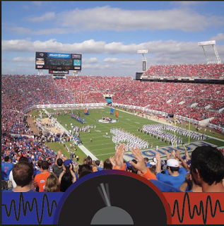
I chose a picture at a University of Florida game where the crowd was split into different colors. I then used the burn tool in photoshop to darken the blue side of the crowd. I decided to create a noise meter because that is a common thing that they will do at sports events. I used illustrator to create this part of the image. I first just drew two color blocks of blue and red. I then used the pen tool to create the sound waves on the side of the meter. For the outside rim of the meter I used the gradient tool to show it fading from blue to red. I wanted the hand of the meter to look as if it was moving so I used a blur effect for all three of the meter's hand that I created. I also changed the opacity of the two hands on the sides. 


For the sound of a car driving over an old bridge I used a photo of an old bridge and moving car that I had. I wanted the sound to be of the car hitting lots of bumps while it was driving over the old bridge. I first created a bumpy road sign in illustrator using the pen tool. I then took the image of the moving car and duplicated it two times, slightly changed the size of each one and positioned them to make it look like the car was going over bumps.