Tuesday, July 31, 2012

Final Sound as Image Blog


I only used illustrator to create this image. I used the pen tool to create the silhouettes of each of the men first. I then used created the political symbols on their podiums using the pen tool also. I wanted it to look like they were angry and shouting and upset so I added the three lines coming out of each of their mouths with gradient coloring. I used the pen tool again to create the different symbols above each of their heads to show their anger. Political debates can become very heated, angry, and loud so I tried to have my picture accurately represent that. 


I decided to create the sound of nails on a chalkboard as my self chosen picture because it is a well known hated sound. I used the gradient mesh tool to create the coloring of the chalkboard. I then used the pen tool to create the hand and finger nails of the person's arm. I added a shadow effect under the person's hand. For the fingernail lines on the chalkboard I used the paintbrush tool and then used the radial blur effect. Finally for the numbers I used the paintbrush tool because I didn't want the numbers to look perfect, I wanted them to look how they would if someone actually wrote them on a chalkboard. This image was also created only using illustrator.  


When I thought of long distance lovers talking I immediately thought of video chatting. I used illustrator to created the bottom strip of the picture, and used photoshop to adjust the actual photos. For the bottom strip that I created in illustrator I used various shape tools and the pen tool to recreate what what a video chat screen would look like. This was a relatively simple idea, but I think it gets the point across pretty well. 


I used only illustrator for this image of the spinning fan. I used the pen tool to create the fan. Then added effects to the fan to make it look more realistic. I used the radial blur effect on the fan's blades to make them look like they are spinning. For the background I added a tile effect and then created three swirls to place in between the fan's blades. I wanted my image to show a swooshing sound. 


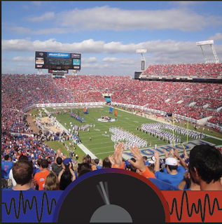
I chose a picture at a University of Florida game where the crowd was split into different colors. I then used the burn tool in photoshop to darken the blue side of the crowd. I decided to create a noise meter because that is a common thing that they will do at sports events. I used illustrator to create this part of the image. I first just drew two color blocks of blue and red. I then used the pen tool to create the sound waves on the side of the meter. For the outside rim of the meter I used the gradient tool to show it fading from blue to red. I wanted the hand of the meter to look as if it was moving so I used a blur effect for all three of the meter's hand that I created. I also changed the opacity of the two hands on the sides. 


For the sound of a car driving over an old bridge I used a photo of an old bridge and moving car that I had. I wanted the sound to be of the car hitting lots of bumps while it was driving over the old bridge. I first created a bumpy road sign in illustrator using the pen tool. I then took the image of the moving car and duplicated it two times, slightly changed the size of each one and positioned them to make it look like the car was going over bumps. 

Monday, July 30, 2012

Sound as Image-Chalkboard

I don't have very much time to write out this blog because I'm at work until 6, but over the weekend I worked more on the sound as image project and created one that I made up myself. I only used illustrator and decided to create the sound of nails on a chalkboard.


I used the pen tool to trace around the hand, the gradient mesh tool for the coloring of the chalkboard, and the paintbrush tool to write out the numbers. I also used a few different effects for the hand and scratched part of the chalkboard.  


Friday, July 27, 2012

Sound As Image Project-Political Debate

I decided to create the sounds as image political debate part of the project using only illustrator. I first found an image of two people debating and used the pen tool to trace around it and make silhouettes.


I then used the pen tool again to create the republican and democratic symbols to place on each podium, so it would be obvious that the two people in the picture were having a political debate.  


I wanted to show that these two people were having an intense debate with lots of yelling so I added in some lines in front of their mouths to show that they were yelling, and different shapes above their heads to make them look angry. 


Thursday, July 26, 2012

Finished Gradient Mesh Project


I am so happy to say that my gradient mesh project is finally finished. 


I started out by using the pen tool to outline each one of the cow's spots. For some of the spots I even broke them down into smaller sections because of the difference in color. I then used the gradient mesh tool to fill in the spots with the correct coloring. I then broke down the body of the cow into three separate sections and used the gradient mesh tool to fill each one of them in also. 


I then used the pen and gradient mesh tool to create the neck, handle, and top of the kettle. The silver part of the handle looked dull, so I experimented with a few different effect to try and make them look shiny like the original picture. The plastic wrap effect worked best for this. 


I moved on to the cows head and bell where I also used the pen and gradient mesh tools. 


The head of the cow was still missing a lot of detail so I used the pen tool, shape tool, brush effect, and changed the opacity on parts to make it look like the original photo. 


I used the pen and gradient mesh tool to create the background line at the bottom, and filled the background with the correct coloring. I then created a small layer at the bottom of the cow, filled it with grey, and used the drop shadow effect to create the shadow under the cow. 


This project was definitely a great learning experience, but I am very glad that I finally have mine finished! 


Wednesday, July 25, 2012

Sounds as Image Progress

Yesterday I began working on the sound as image project. I first started working on the creating the sound of a car driving across an old bridge, and then the sounds of a spinning fan. I mainly used photoshop for the car driving across an old bridge sound. I started by placing a picture of a car that was moving on the first layer. Then added a mask on it to eliminate the background. I placed the layer of the bridge over it and used the masking tool and skew tool to make it look like the car was driving on the bridge. I then went into illustrator and created a bumpy road sign to place by the bridge and added it back into my photo in Photoshop. I decided to duplicate my car into three separate layers and slightly stagger them to make it look as if the car was going over bumps. Here's where I'm at so far.


I decided to only use illustrator to create the sound of a spinning fan. I used the pen tool to create the image of a fan, then used the blur effect for the blades of the fan to make it look like they were spinning. I placed a blue tile effect as the background of the image, then added in a few swirls that I filled in with a gradient color to try and create an image of a swooshing sound. 


Tuesday, July 24, 2012

Finished Opposing Posters

I chose to create posters based off the words Alive and Buried. I was first inspired to use the word alive because I wanted to create one that showed a concert. After going through a variety of different words that I could use for my opposing poster, I finally decided on using buried. The concept of these posters were to show the physical and emotional concept of being alive and buried. Alive, as in actually living, and the feeling of great happiness, and buried as being physically dead and buried, or being overwhelmed. I started creating my poster for buried first, and chose these pictures to work with.


I then put each picture into a different layer and began experimenting with the masking tool and opacity. I placed the close up picture of me in the snow onto of the picture with the rocks and water and then created a mask on the picture of me.

I started creating more masks on the other layers and added in the picture of the stone wall and grave stone. I wanted my text to fit in with the feeling of the poster, so I created a layer mask for that too and  used the stylize tool to add the tiles filter to it. 


My alive poster was much more difficult for me to create because I tons of different pictures that I really liked and wanted to use. After creating 4 different posters and playing around with the masking, adjustment, sharpening, and effects tools I finally decided on the poster that I would use. For this poster, I chose these three pictures to start out with. 


I used the concert picture as the bottom layer, the placed the laser picture with a payer mask above the concert picture. I then used the sharpening tool to go over the crowd in the concert picture. I was constantly adjusting my opacity level for the masking layers in this poster too. 


I placed the picture of the green dots on another layer above both of these pictures and added a layer mask to that one too. I added my text to the left hand corning of the picture and used the bevel and emboss effect. I also experimented with adjusting levels and lighting in this poster.


Sunday, July 22, 2012

Poster Project Progress

I have been working on my second poster for the opposing poster project today, which is for the word alive. I've definitely hit a creative roadblock on this one, so I'm taking a little break until tomorrow. I wanted my poster to show a concert mixed with a cool light show, because I feel the most alive when I'm at a concert.  The biggest problem that I have been having with this poster is deciding which pictures I like the best. For the past four or five hours I've been experimenting with the masking tool and trying to create a mixture of pictures that can encompass the feeling of being alive. So far I have made about 4 different versions of my poster, but still can't seem to create one that I love. Here are some of the ideas that I came up with earlier today. I really love two of the layers, the green circle wall, and the pink and green lasers, just still not sure about the others. These are all incomplete, and if I end up choosing one of these there will be more added on.

I'm leaning towards the first one as being my favorite right now, but still am not sure.


Friday, July 20, 2012

Progress Update on Gradient Mesh Project

I have continued working on the gradient mesh project for the past 2 days, and have finished all the basics, but now just need to go back through and add a few touch ups. I broke down the parts of the cow into smaller sections to create a better result for the gradient mesh effect. I created a new layer for each smaller section of the cow to make it easier to work with. I then went through and began applying the gradient mesh effect to each one, which was very time consuming. I have realized how difficult it is trying to crate a 3D image to look exactly like a photograph. The bell and metal parts of the handle were definitely the most difficult parts for me to try and create because I haven't been able to get the metal to look the same as the metal in the photograph. Here are a few pictures of my progress along the way for this project.


Where I'm at now


Since I divided up the cow into so many smaller sections the sections don't completely fit together completely. I was thinking of trying to do a large gradient mesh of the body part of the cow and then lay the images over at adjust the opacity for some of the to try and make them all blend together better. Or just moving the pieces around a little. I also still need to go back and add detail to certain parts of the cow, especially the face. 


Wednesday, July 18, 2012

Poster Project and 3D Illustrator Project Update

During class and after class yesterday I worked for a while on the 3D illustrator project. I haven't gotten very far because I keep having to redo certain parts of it to try and make it look accurate. I chose to do the cow tea kettle and started off by recreating the spots. I divided the first spot I did into two different sections because the colors in the spot were drastically different. Then I used the pen tool to trace around the spot. I made a duplicate of the traced layer and then filled one of them in with gradient white to black coloring. I planned to have this in the background incase the two separate spots that I traced did not match up exactly. Then I traced the black and grey section of the spot and used the gradient mesh tool and eye dropped tool to recreate it. Once I was done I put it all together.

I followed this formula for the second spot that I created, and then did the third, which was easier because I didn't need to separate the spot into separate color sections. 

I then started working on the white party of the cow's body. I used the pen tool to outline the section I wanted, then used the gradient mesh and eyedropper tool to color it correctly. 

I still have a long way to go on this project, but at least I'm making some progress. 

On a different note, I also started working on my Photoshop poster project last night and ended up getting pretty far along. I came up with the idea to make my two opposing posters be alive and buried. I really wanted to make one that showed a concert, and in my opinion there is never a time when I feel more alive than at an awesome show. When I started thinking of my opposing poster I went through a few different words before buried came to my mind. I chose to do buried because both alive and buried can have double meanings that I want to show in my posters. I wanted to show buried as being actually dead and buried under the ground, and show it as being overwhelmed. Whereas, I wanted to show alive as being physically alive and also having the energetic feeling of extreme happiness. I was really looking forward to starting my poster for alive, but for some reason I started on buried first, and I'm actually really loving the way that it is turning out. 

I started out by going through my photos and just picking out different ones that reminded me of the word buried. I then made a few different Photoshop documents and began experimenting with different groupings of pictures. I applied masks to certain pictures and then played around with the opacity. I also switched the pictures around a few times before deciding on the final layout of the picture. Here is what I've got so far, it's kind of emo looking, but oh well. 


Tuesday, July 17, 2012

Finished Photoshop Project


Finished Photo 


Original Photo 

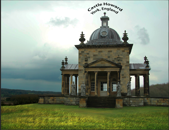
After a lot of time experimenting with all of the different Photoshop tools, my project is finally finished.
I have incorporated all of the different tools that we were required to use for this project, along with a few others that I discovered along the way.


Clone Stamp 
I loved using the clone stamp, and used it for a few different parts of my project. I used it first to add another statue to each side of the building, then to get rid of the middle statue design up towards the top of the building. I also used it to cover up the dark spots on the left and right side of the building. I did this by cloning other, cleaner, parts of the brick and going over the blackened parts with it. Finally, I used it to get rid of the small sign at the bottom of the steps, by cloning a different part of the step to place over it.


Brightness and Contrast and Levels and Curves 
I adjusted the brightness, contrast, levels, and curves to make the sky darker and more of a vibrant blue than the original picture. I also used these to adjust the bush on the right side of the building in the background, and the trees on the left side, background of the building so that they would be darker and blend better with the sky.


Layer Styles Tools 
I used the layer styles tools to add a drop shadow effect to the trees on the left side of the building in the background to enhance their look and help them to blend better. 


Healing Brush 
I got rid of the dots on the roof by going over them with the healing brush. 


Paint Brush and Additional Adjustment Tools 
While experimenting I discovered how to create a mask, so I added a fresco effect on the grass layer, then used the brush tool to mask the effect.  


Text
Finally, I used text and added an effect to it to title my project. I chose this effect because I thought it fit nicely with how the roof of the building curved.